ANZ Gothic
Can a 150 years of brand history and stories be told in an immersive experience?
My Role
User experience and content design for digital interactions
Art direction for animation and interface design
CMS content structure and metadata planning
Visitor journeys and prototyping
Collaboration with architects, developers, and curators
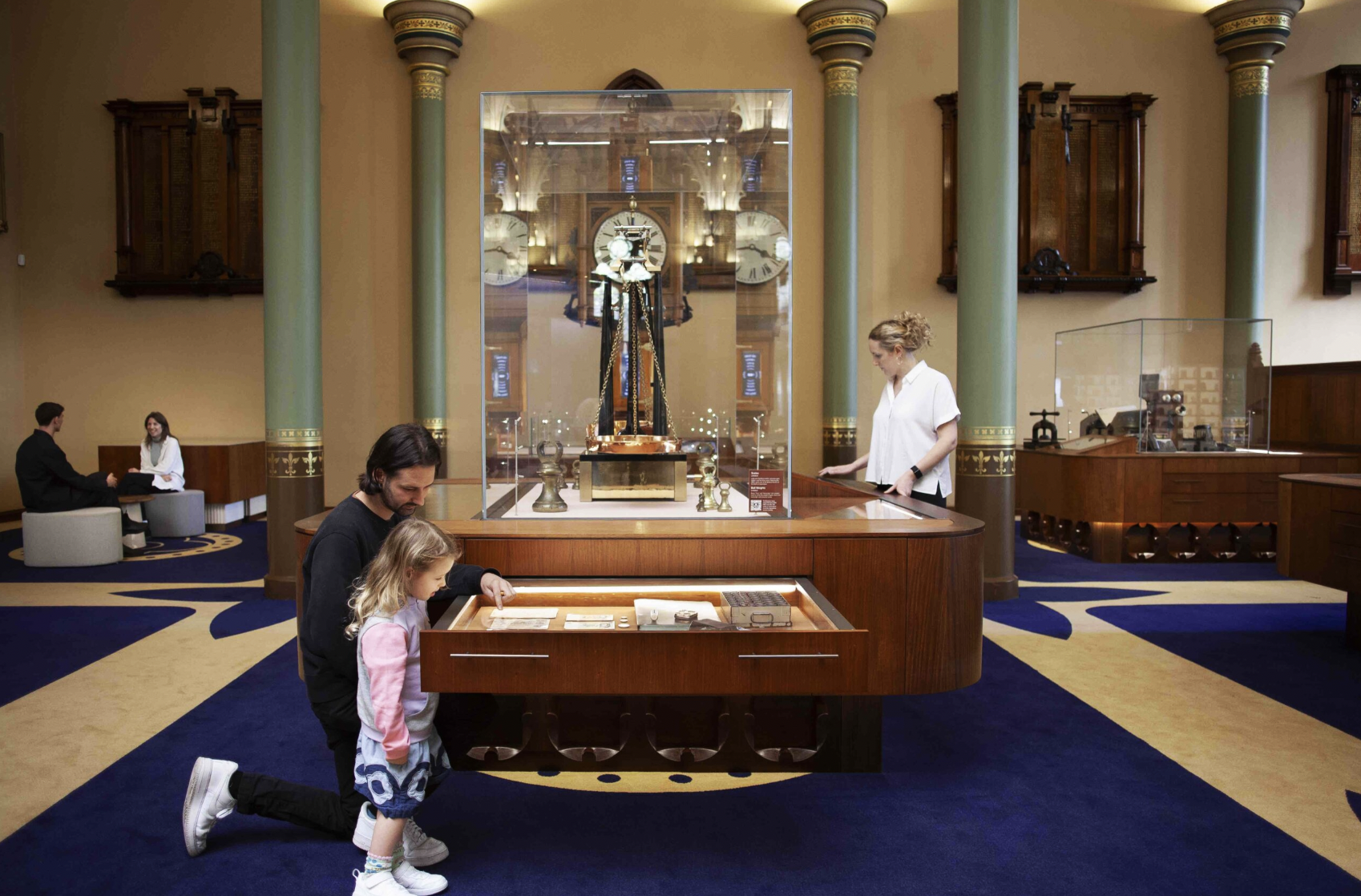
A system-led experience and product design project that transformed complex historical content into an accessible, modular digital experience. The work balanced heritage context with contemporary interaction, focusing on scalability, accessibility, and long-term storytelling.
CollaboratorsFoolscap Studio, James Makin Gallery, Peter King Studio, Sandpit
Process
I worked from concept through to delivery, framing the experience around user needs, system constraints, and long-term scalability before moving into form and interaction.
My process prioritised aligning goals across multiple teams, rapid validation through prototyping, and building design systems that could scale with future content and technology.
Research and data had been previously done so we opted to structure our design needs around archetypes over developing new personas. This simplification helped keep content, design and stakeholders on the same page. Three archetypes were developed: School Groups, with teachers and students, tourists and banking customers, each with their own needs, goals and visitor journeys.
Experience and Product Design
Visual Design
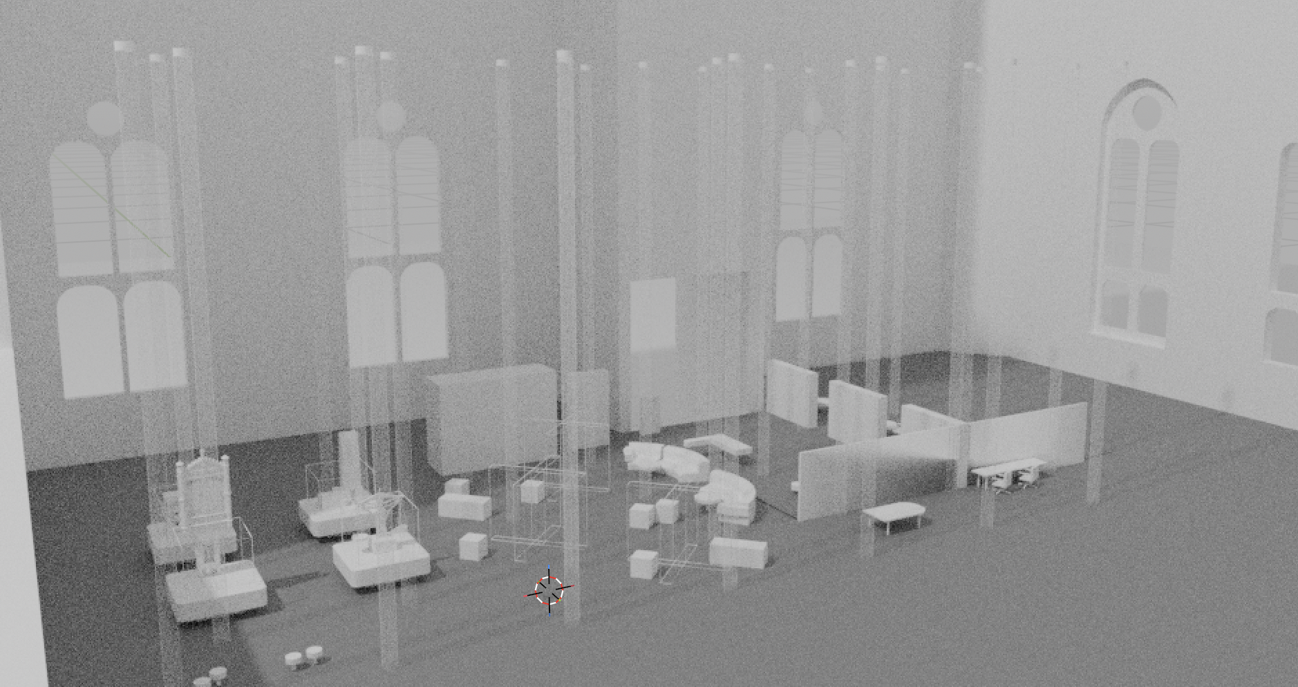
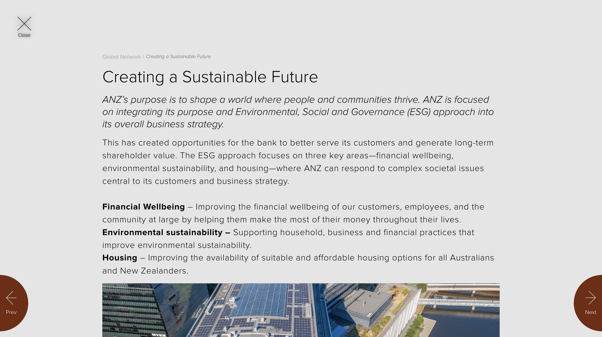
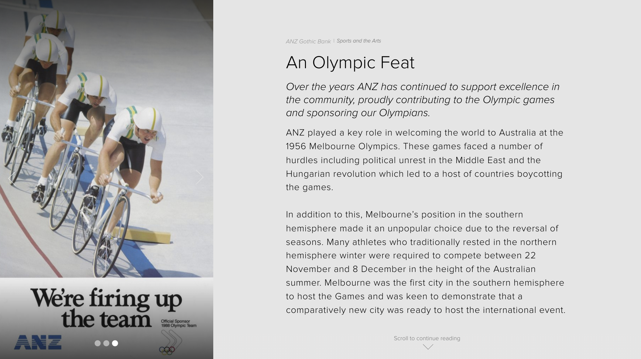
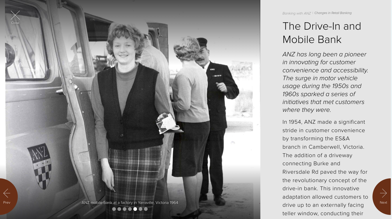
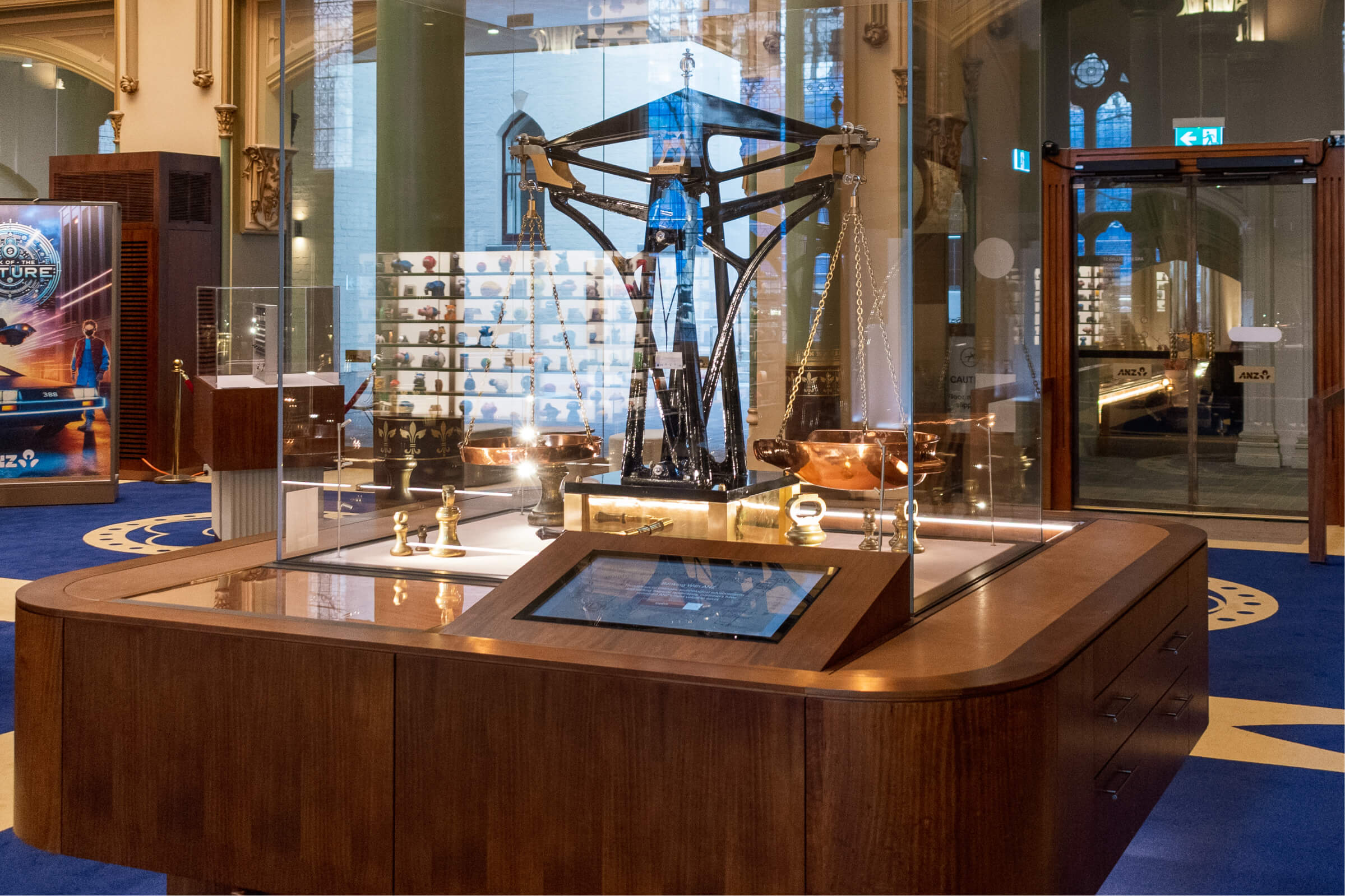
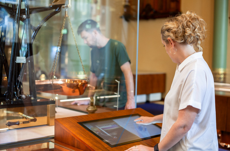
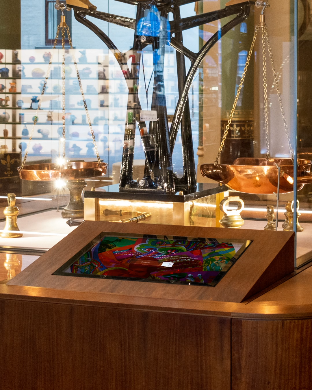
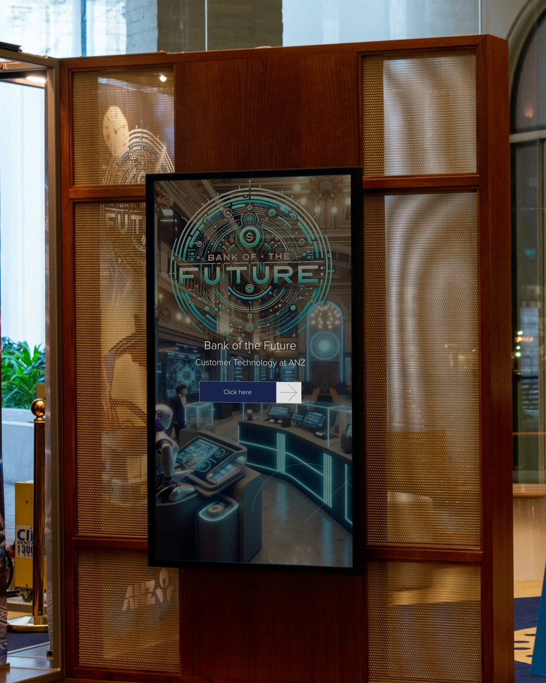
The Welcome Wall used motion sensors to greet visitors and reveal a 3D map of the building, while the permanent exhibition touchscreens enabled intuitive browsing of historical stories without visual clutter.
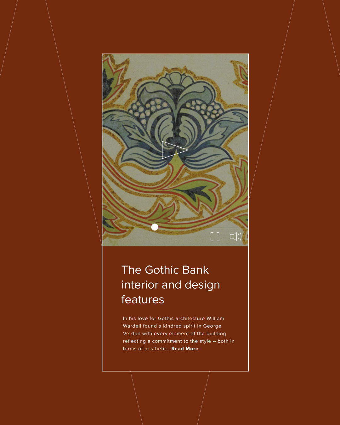
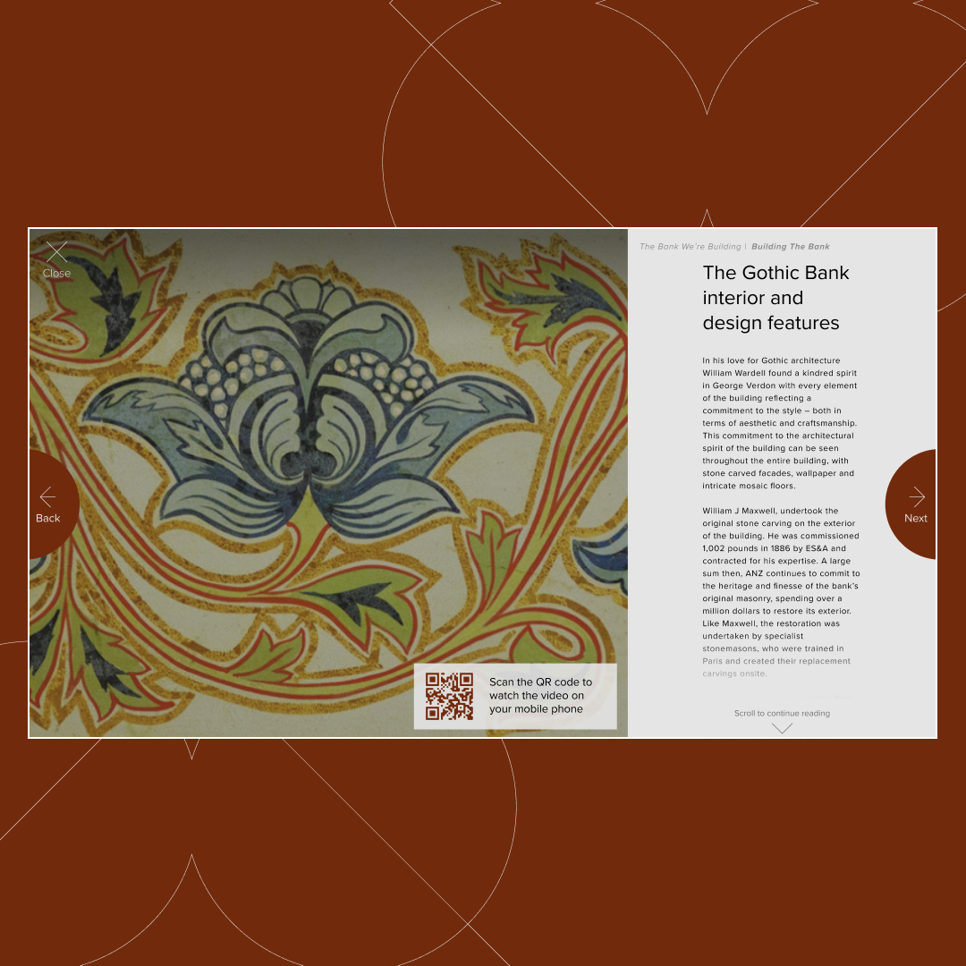
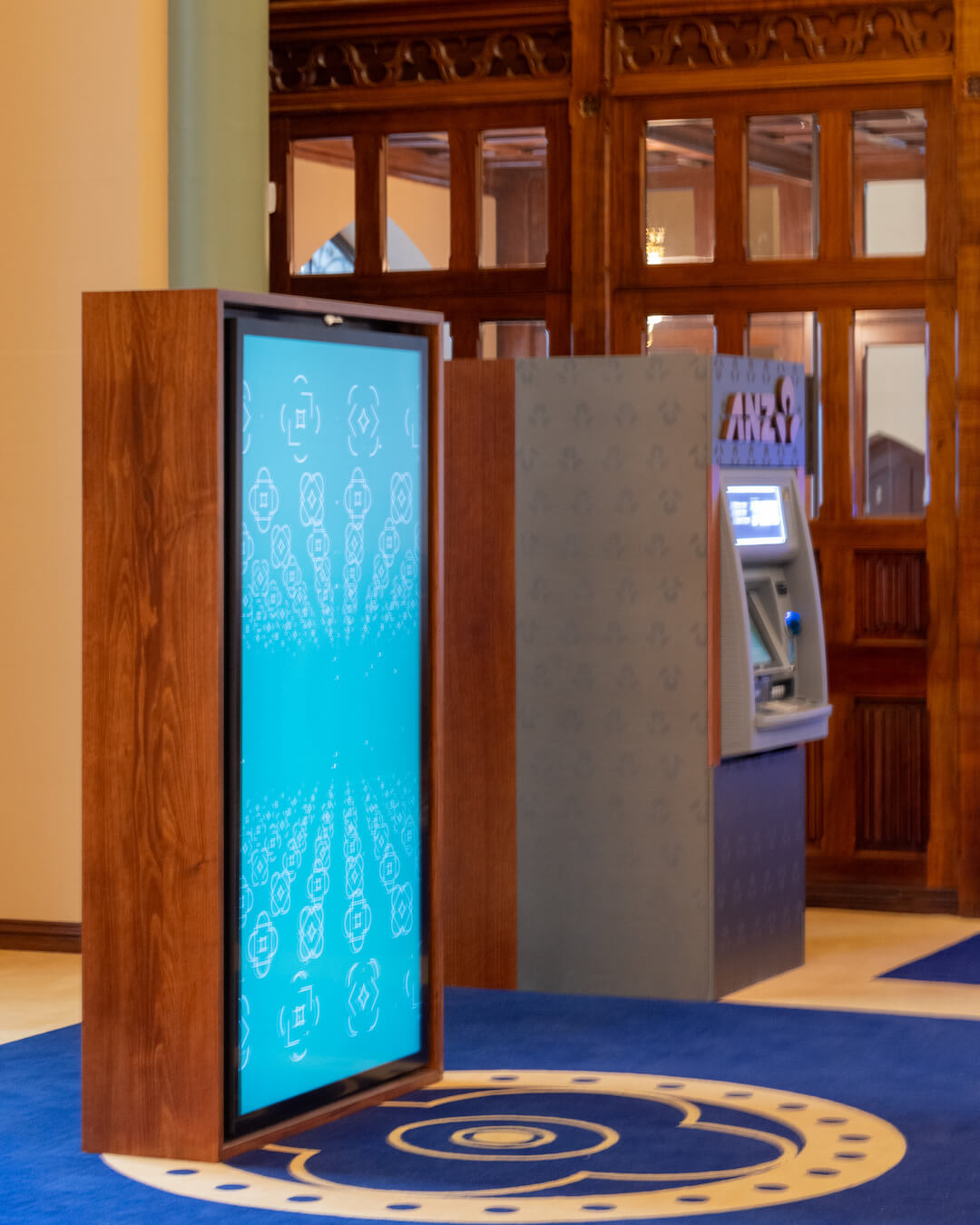
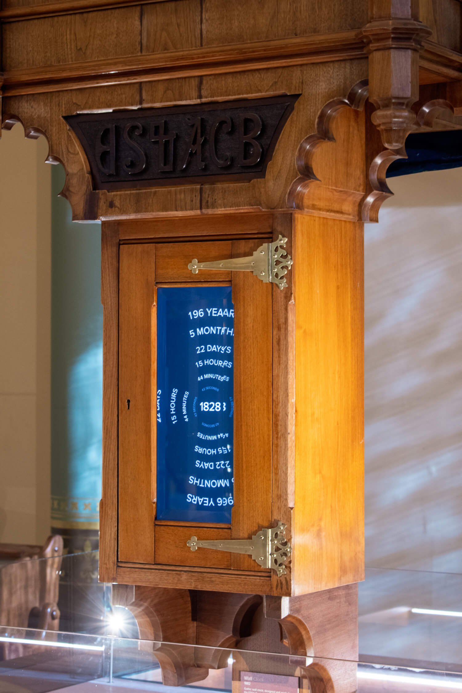
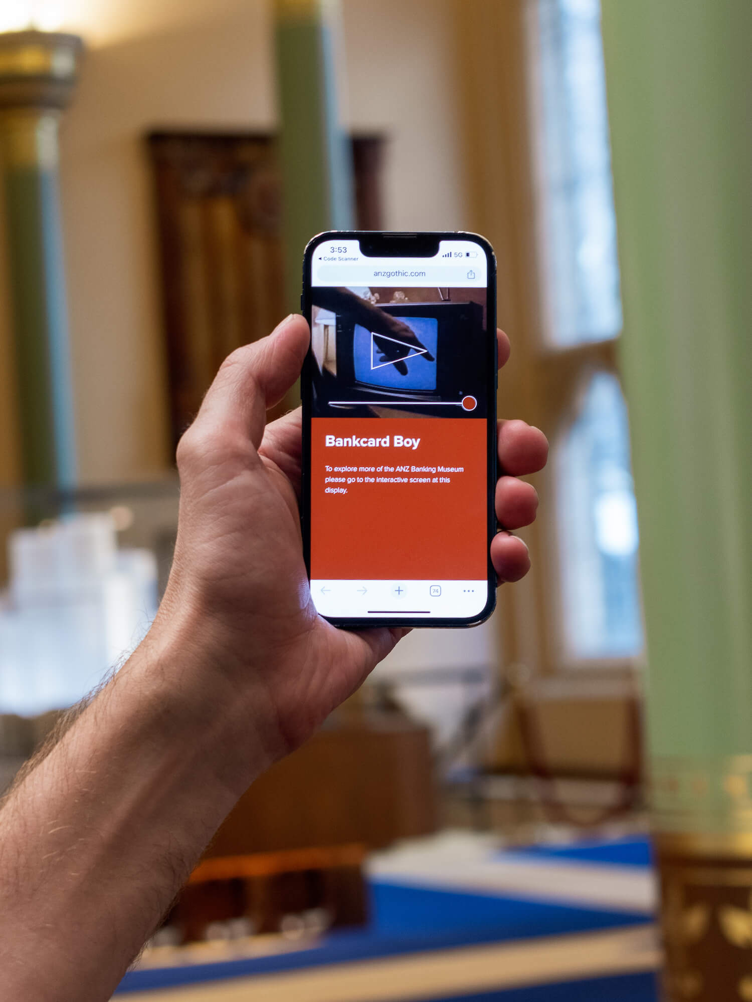
QR codes extended the experience beyond the displays, linking physical artefacts to deeper digital content. Visually, the interfaces followed the building’s gothic details through deep tones, gold accents, all designed with accessibility at the forefront.

Outcomes
Increased visitor diversity, engagement, and dwell time. Seamless and accessible integration of multimedia and digital experiences into heritage elements.
A flexible CMS that enables long-term storytelling opportunities and easy-to-use content management by ANZ staff.
The visual interface and motion design added a modern feel while remaining unobtrusive, responding sensitively to the heritage materials, lighting, and elaborate architectural character of the building.
Other Case Studies
Digital Platform WA Museum Boola Bardip
→
Atomospheric Lab
→
ANZ Gothic
Can a 150 years of brand history and stories be told in an immersive experience?
My Role
User experience and content design for digital interactions
Art direction for animation and interface design
CMS content structure and metadata planning
Visitor journeys and prototyping
Collaboration with architects, developers, and curators

A system-led experience and product design project that transformed complex historical content into an accessible, modular digital experience. The work balanced heritage context with contemporary interaction, focusing on scalability, accessibility, and long-term storytelling.
CollaboratorsFoolscap Studio, James Makin Gallery, Peter King Studio, Sandpit
Process
I worked from concept through to delivery, framing the experience around user needs, system constraints, and long-term scalability before moving into form and interaction.
My process prioritised aligning goals across multiple teams, rapid validation through prototyping, and building design systems that could scale with future content and technology.
Experience and Product Design
Research and data had been previously completed, so we structured our design approach around archetypes rather than developing new personas. This simplification helped keep content, design, and stakeholders aligned. Three archetypes were developed: school groups (teachers and students), tourists, and banking customers. For each, we focused on three core questions: what do they need, what is the easiest way to deliver that, and how can it be made enjoyable?
The digital experience was mapped as a cohesive, single journey, enabling one interface system to support a wide range of audiences across multiple interactive touch points. Each screen and interface supported varying levels of engagement, from brief “I get it” moments to deeper historical exploration through text and media.
Information architecture design was crucial in allowing themes, sub-themes, and individual stories to function as a single narrative. The content design followed a T-shaped viewing model, allowing visitors to skim main topics, dive into sub-themes, and then explore selected stories in depth. Content design for WordPress was developed collaboratively with developers and exhibition design teams.
The experience design resulted in a suite of connected moments and content that could stand alone as short stories or link together to create a deeper, more immersive narrative.

Visual Design
The Welcome Wall used motion sensors to greet visitors and reveal a 3D map of the building, while the permanent exhibition touchscreens enabled intuitive browsing of historical stories without visual clutter.
QR codes extended the experience beyond the displays, linking physical artefacts to deeper digital content. Visually, the interfaces followed the building’s gothic details through deep tones, gold accents, all designed with accessibility at the forefront.


Outcomes
Increased visitor diversity, engagement, and dwell time. Seamless and accessible integration of multimedia and digital experiences into heritage elements.
A flexible CMS that enables long-term storytelling opportunities and easy-to-use content management by ANZ staff.
Visual interface and motion design added a modern feel while remaining unobtrusive, responding sensitively to the heritage materials, lighting, and elaborate architectural character of the building.
Other Case Studies
ANZ Gothic
Can a 150 years of brand history and stories be told in an immersive experience?
My Role
User experience and content design for digital interactions
Art direction for animation and interface design
CMS content structure and metadata planning
Visitor journeys and prototyping
Collaboration with architects, developers, and curators

A system-led experience and product design project that transformed complex historical content into an accessible, modular digital experience. The work balanced heritage context with contemporary interaction, focusing on scalability, accessibility, and long-term storytelling.
CollaboratorsFoolscap Studio, James Makin Gallery, Peter King Studio, Sandpit
Process
I worked from concept through to delivery, framing the experience around user needs, system constraints, and long-term scalability before moving into form and interaction.
My process prioritised aligning goals across multiple teams, rapid validation through prototyping, and building design systems that could scale with future content and technology.

Discovery
Workshops

Developer Handover

Research

Content
Strategy

Prototype

Product Design

Delivery
Experience and Product Design
Research and data had been previously completed, so we structured our design approach around archetypes rather than developing new personas. This simplification helped keep content, design, and stakeholders aligned. Three archetypes were developed: school groups (teachers and students), tourists, and banking customers. For each, we focused on three core questions: what do they need, what is the easiest way to deliver that, and how can it be made enjoyable?
The digital experience was mapped as a cohesive, single journey, enabling one interface system to support a wide range of audiences across multiple interactive touch points. Each screen and interface supported varying levels of engagement, from brief “I get it” moments to deeper historical exploration through text and media.
Information architecture design was crucial in allowing themes, sub-themes, and individual stories to function as a single narrative. The content design followed a T-shaped viewing model, allowing visitors to skim main topics, dive into sub-themes, and then explore selected stories in depth. Content design for WordPress was developed collaboratively with developers and exhibition design teams.
The experience design resulted in a suite of connected moments and content that could stand alone as short stories or link together to create a deeper, more immersive narrative.
Visual Design
Using the building materials, architectural palette, and the ANZ brand, a refined visual language was developed to bridge the gap between site-specific context and brand guidelines. As the interactions were designed for in-person use, accessibility extended beyond digital considerations; reach, lighting, and physical access became key drivers in the creation of the design system.
Building on the content and experience design, a base wireframe system was created. Using Figma’s API, live data was used to populate and test layouts and concepts quickly. After multiple rounds of workshops, Miro boards, and spreadsheet iterations, a modular content design system was developed, enabling a visual interface that was both cohesive and adaptable.
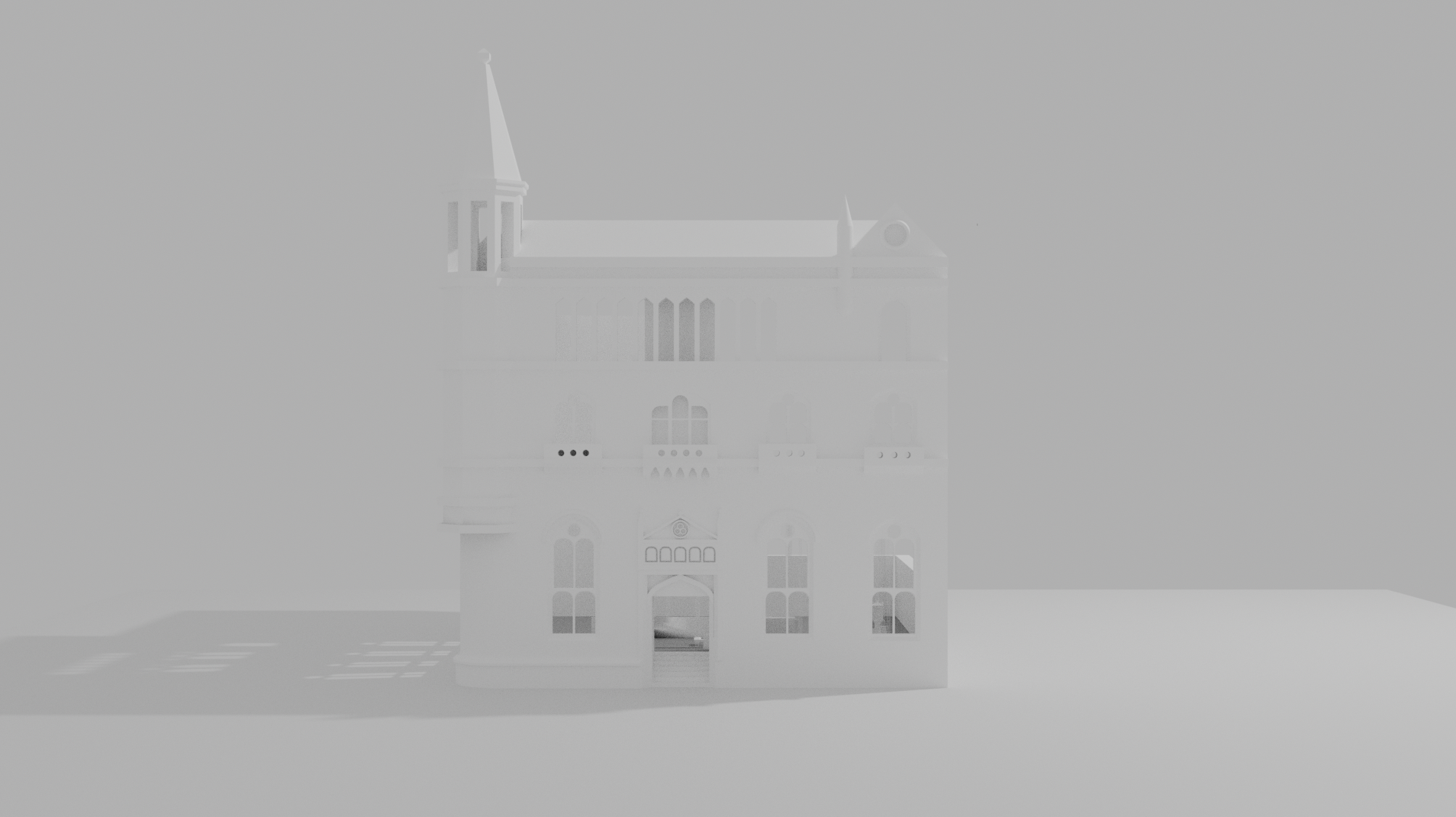
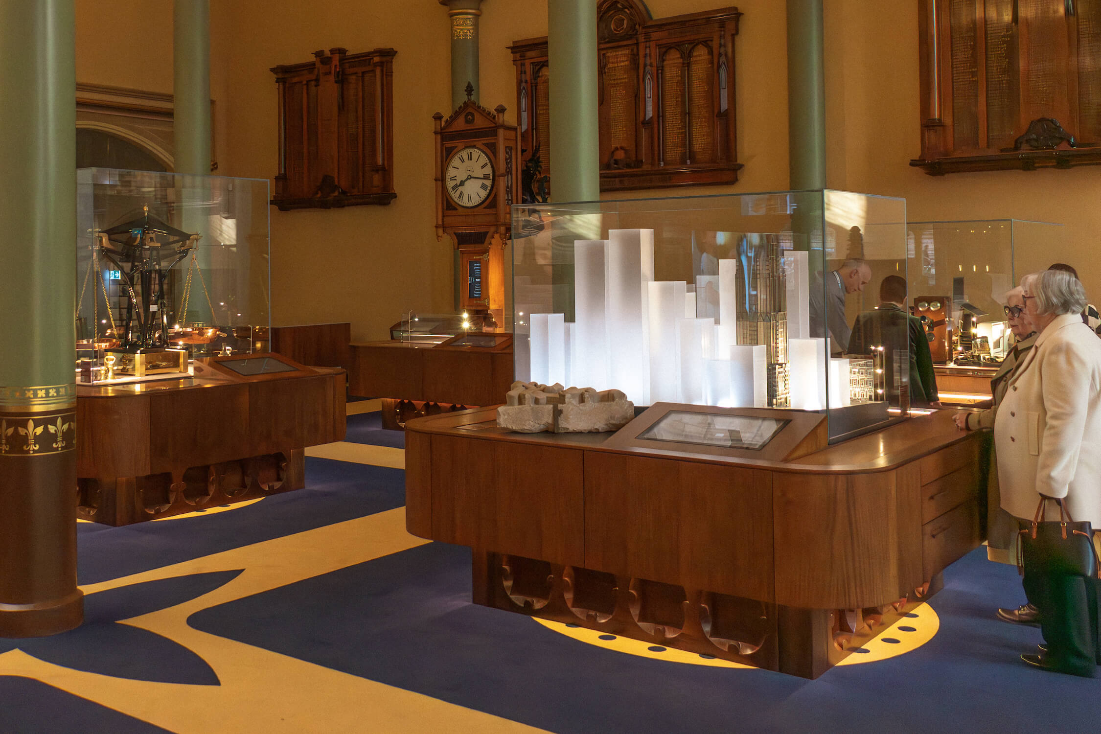
Wayfinding was a crucial element of the in-bank experience. Following a series of user tests, an architectural model of the building was used to create a 3D map. This process allowed visitors to locate banking services and content and, when rendered in real time in Unreal Engine, created a striking tribute to the building through lighting and spatial detail.
Motion was introduced to make interactions feel contemporary and used selectively in transitions and small moments. The motion design reflected the proportional and geometric themes seen in the building’s architecture, with shapes moving to reveal new information.
Working with a team of developers, we built a custom WordPress CMS platform that supports both permanent and rotating content. The result was a design system that utilised dynamic, modular blocks, structured metadata, and media relationships, keeping the system scalable and easy to maintain.
During installation, my role was to test prototypes on-site for quality assurance, ensuring accessibility and usability, validating content quality, and supporting final client sign-off.
The visual design outcome is a tribute to the building’s structure and the brand’s vision of a bank of the future.
As a design system, all users of the digital experiences are supported in accessing information easily through consistent design patterns, while motion design adds a subtle touch of contemporary elegance.


Outcomes
Increased visitor diversity, engagement, and dwell time. Seamless and accessible integration of multimedia and digital experiences into heritage elements.
A flexible CMS that enables long-term storytelling opportunities and easy-to-use content management by ANZ staff.
The visual interface and motion design added a modern feel while remaining unobtrusive, responding sensitively to the heritage materials, lighting, and elaborate architectural character of the building.
Other Case Studies